Sunrise Snacks
Sunrise Fuel – Trail Mix Brand System
Role: Concept Brand + Packaging Design · Self-initiated · 2025
2025
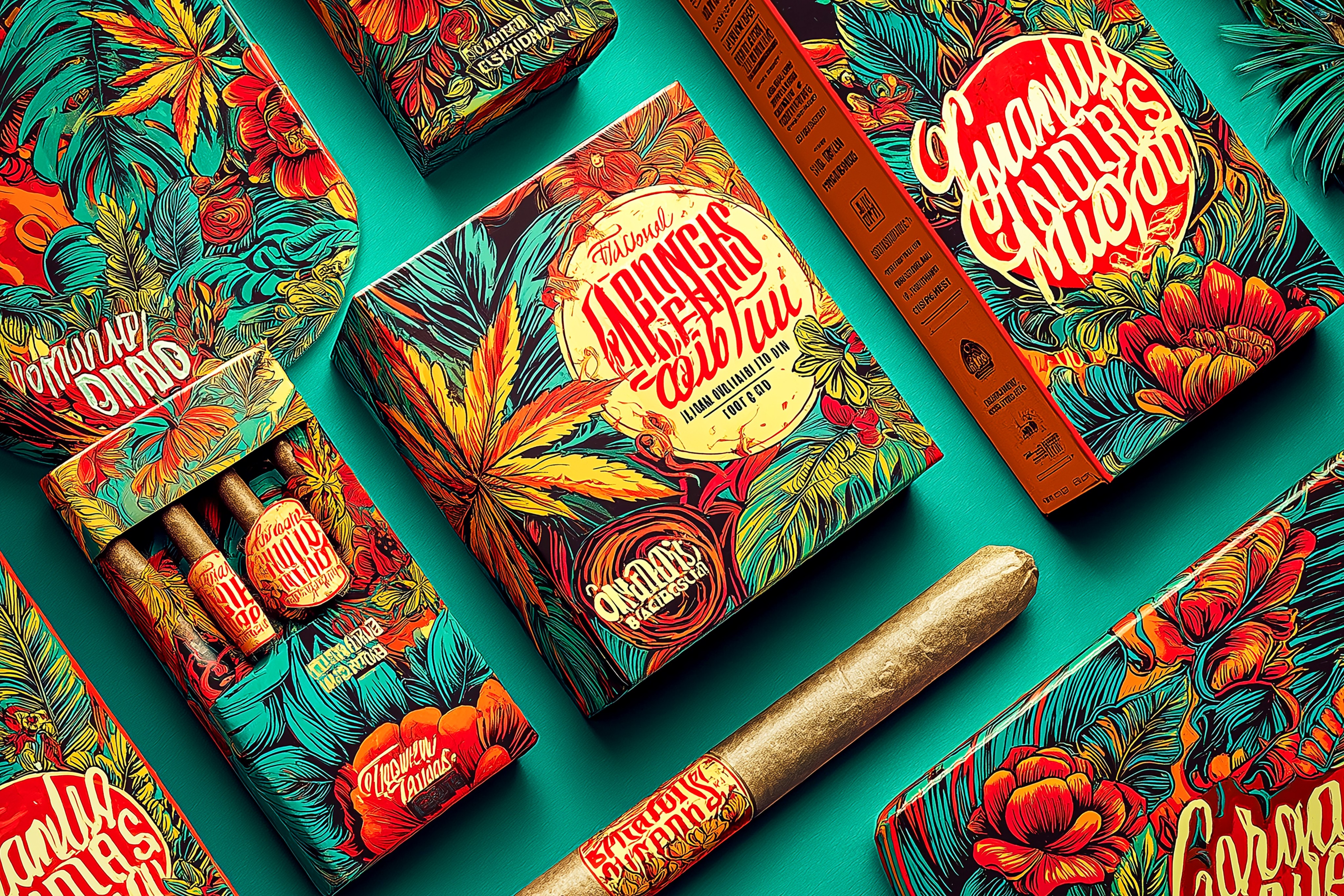
Sunrise Fuel is a self-initiated CPG concept exploring how a trail mix brand could stand out in crowded club-store aisles. The idea was to build a bold, shelf-first visual system with clear flavor differentiation, strong range architecture, and packaging that feels energetic and modern without drifting into kids-snack territory.
SERVICES
Brand Identity Design, Visual Design, Logo Design, Brand Guidelines Development
The brief
Create a bold, shelf-focused packaging system for a trail mix brand that: • Stands out in crowded club-store aisles • Clearly differentiates flavors within a family look • Scales across bag sizes and retail formats without breaking
Sunrise Fuel explores how a modern snack brand can balance visual impact with structure—using color, hierarchy, and illustration to organize multiple SKUs while staying production-ready.
This concept project treats Sunrise Fuel like a real CPG client. I started from the realities of club-store retail: long aisles, visual noise, and fast decisions. The system is built around a strong wordmark, consistent logo placement, and bold flavor bands that are easy to scan from distance. Ingredient illustration and texture live inside that framework, giving each SKU its own personality while keeping the family tight and recognizable.
Approach
Early color, typography, and illustration exploration for the Sunrise Fuel system.
My approach was to design from the shelf out—building rules that would still work under harsh lighting, busy aisles, and quick customer decisions.
I began by auditing existing snack and trail mix packaging to understand where brands start to blend together. From there, I explored multiple layout grids and logo treatments that could stay consistent across flavors and bag sizes. AI tools helped test illustration styles and texture directions, but every final element was rebuilt as clean vector layouts. The focus was always on clarity: dominant brand mark, clear flavor band, and enough space for real-world claims and nutritional information.
Process
A structured path from research and AI experiments to refined layouts and realistic retail mockups.
I treated Sunrise Fuel like a real engagement without the client. The process started with a quick competitive analysis of snack aisles to identify overused patterns and opportunities. Next, I used AI image generation to experiment with illustration styles, lighting, and texture—purely as an exploration layer. Once the visual direction felt right, I moved into Illustrator to build a repeatable grid with fixed logo, flavor band, and information zones. Photoshop came in for mockups and in-context visuals, testing how the system reads at shelf distance. The final step was refining typography, spacing, and hierarchy so the design could realistically move into production.
Design for distance first, detail second. Every SKU should be instantly identifiable on shelf while still feeling like part of a tight, disciplined brand family.
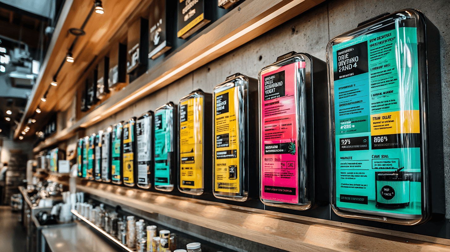
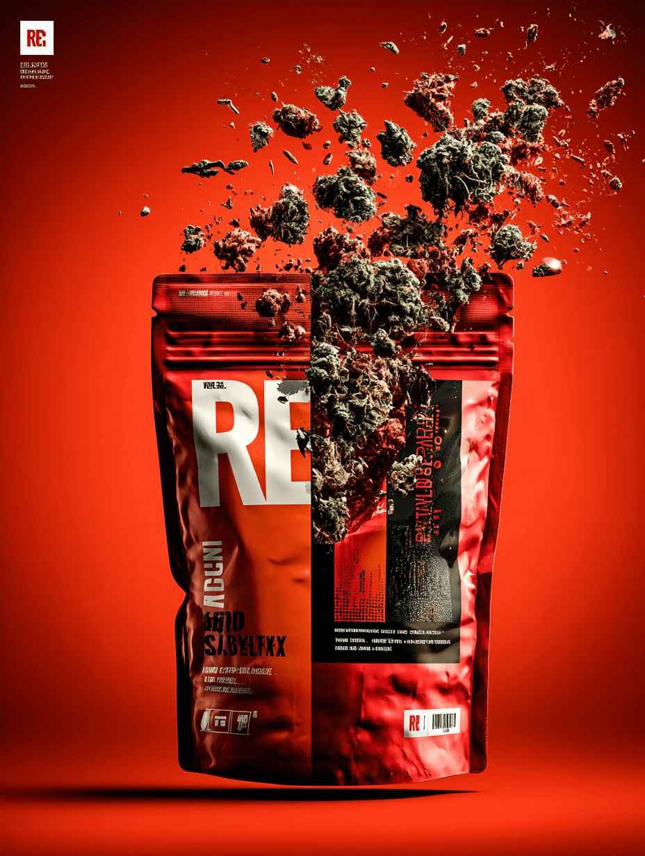
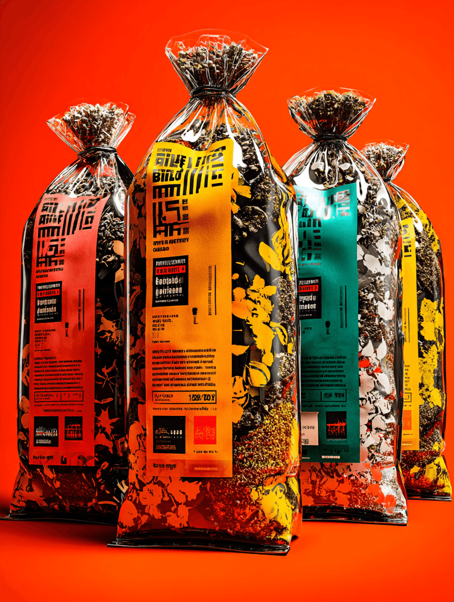
Final Design
A color-driven packaging system anchored by a bold wordmark and modular grid that scales across flavors and formats.
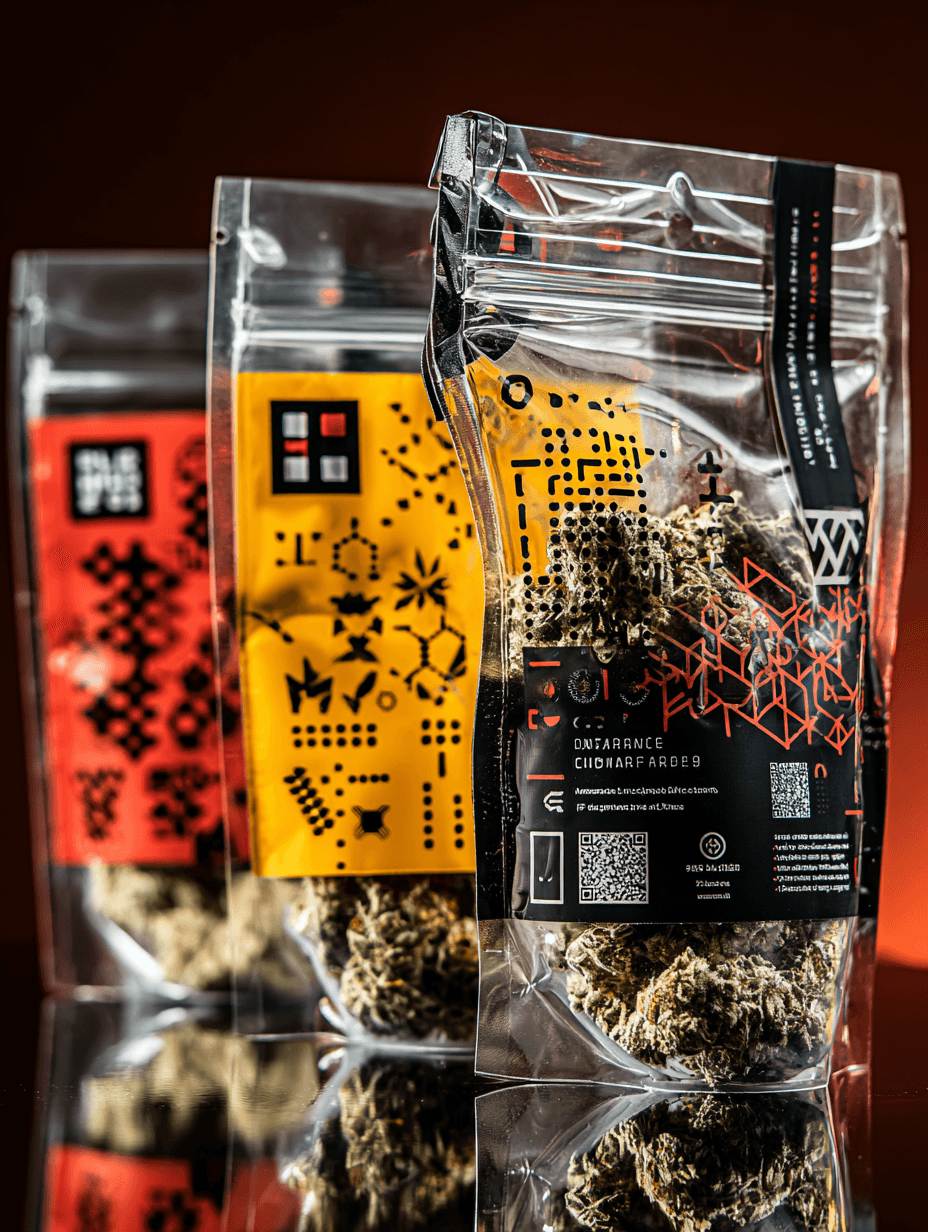
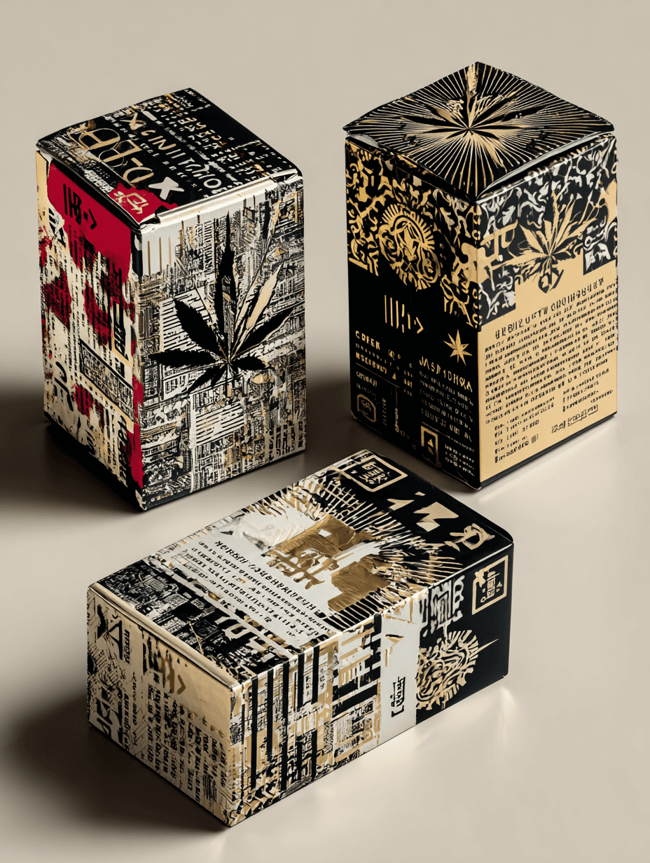
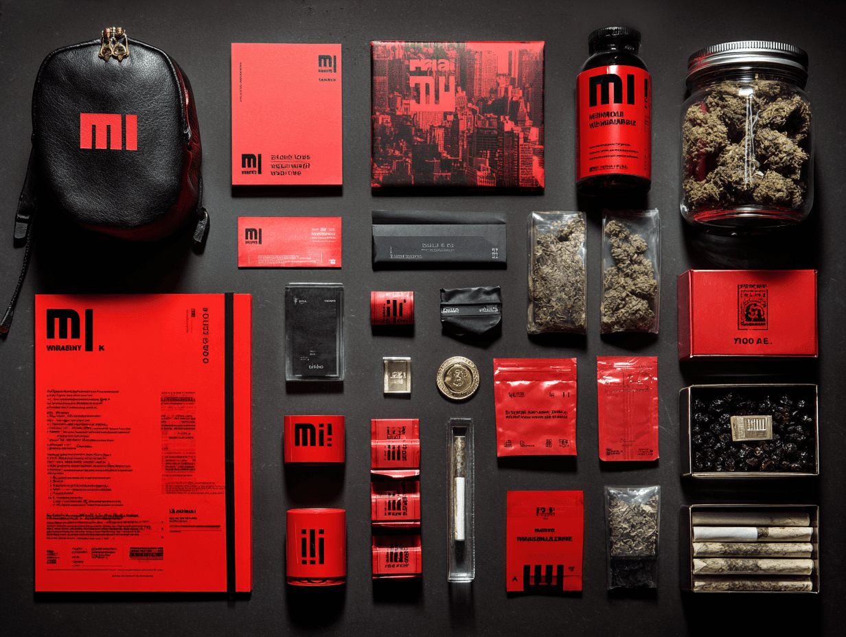
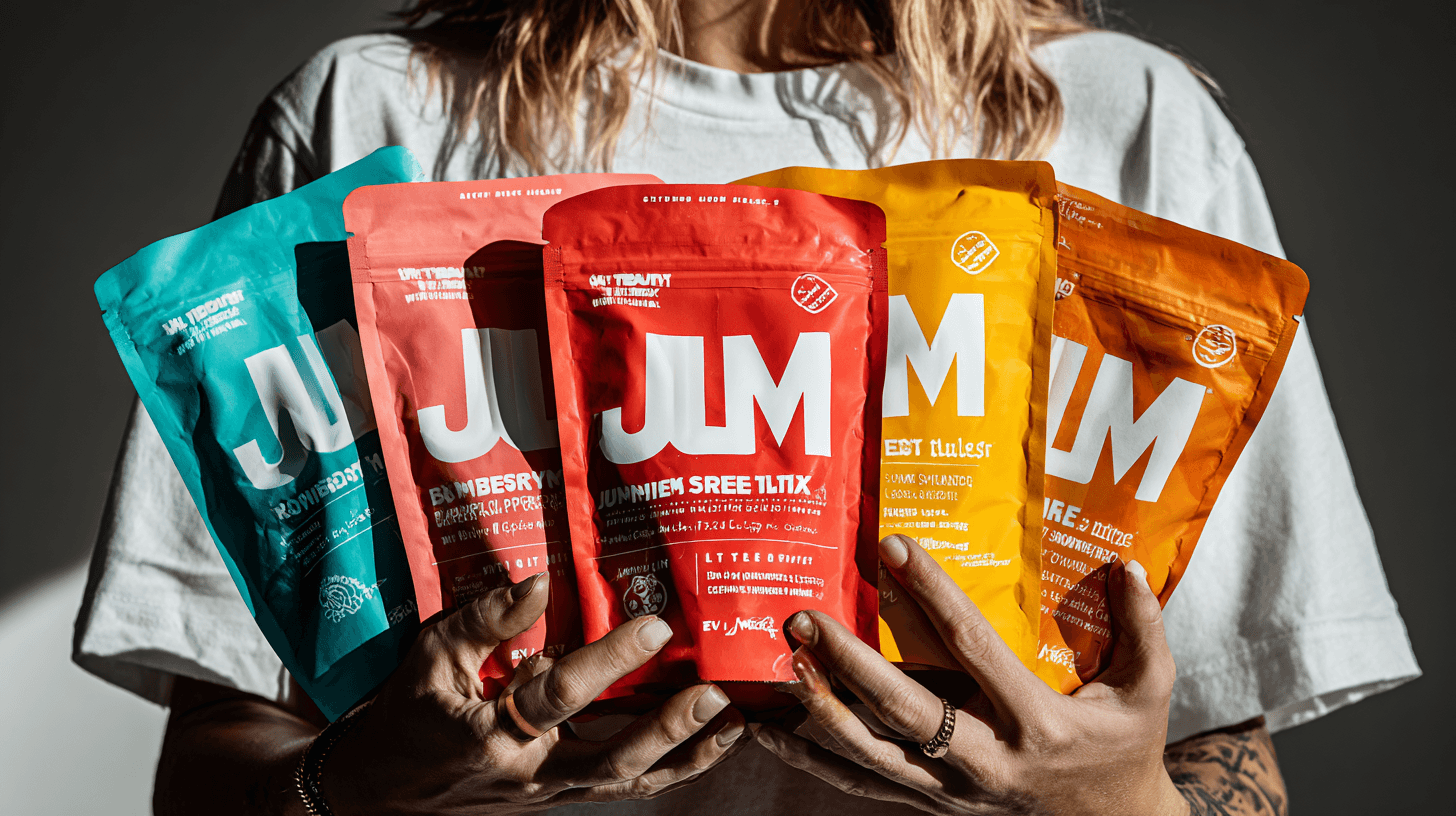
The final Sunrise Fuel system uses a consistent layout across every SKU: a strong wordmark at the top, a bold color band for flavor, and a defined zone for illustration and product messaging. Each flavor gets its own palette and imagery, but the grid, logo placement, and type hierarchy never change. This structure makes the range easy to recognize from down the aisle while still giving room for storytelling, nutrition, and regulatory information. The mockups show how the system holds up on different bag sizes and in club-store style environments, reinforcing the idea that this concept could be taken straight into production with minimal adjustment.
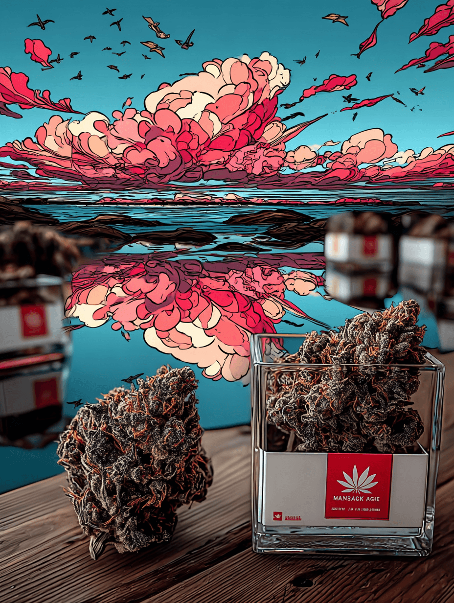
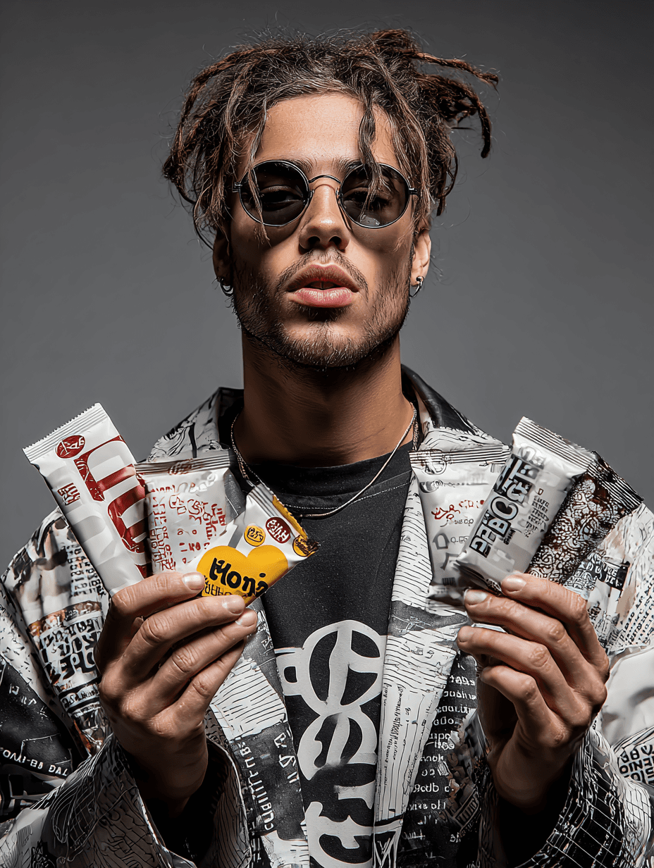
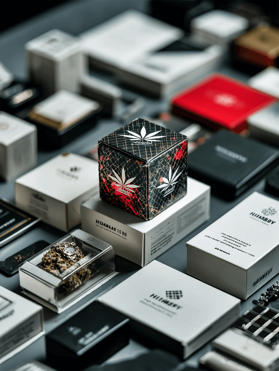
Product Images
Sunrise Fuel is a proof-of-concept for how I think about packaged goods and cannabis-adjacent categories: start from the realities of retail, build a flexible system, and make sure every design decision can survive fluorescent lighting, price tags, and real-world constraints. — Ian Thompson
Achievements
A concept that demonstrates real CPG thinking: system design, color discipline, and shelf-first decision making.
Sunrise Fuel isn’t a real product on shelf—yet—but it reflects how I approach actual CPG and cannabis work. The project shows my ability to: • Build cohesive visual systems for multiple SKUs • Balance bold branding with practical information hierarchy • Use AI as an exploration tool without sacrificing design craft • Create mockups that feel close to production-ready
Shelf impact
Shelf impact